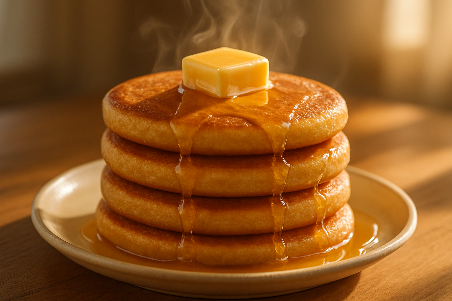
 Original Honey Butter mochi pancake stack with golden-brown exterior and honey drizzle
## Fix summary
- **Logo (blocker):** the stacked "STICKY / STACK" lockup with the rotated `#E8A87C` S‑badge lives in the **site‑wide header template**, not in this page body — adding it here would render a second header on the live site. Flagged back to the template owner; no header markup added below (per platform constraint).
- **Mobile filters (major):** the four filter pills now stay visible on phone (wrapping 2×2, never collapsed/hidden), with tap‑safe sizing and their own explicit mobile rules.
- **Mobile cards (major):** menu grids now explicitly collapse to a single `repeat(1, minmax(0,1fr))` column under 768px, full‑width images on sized containers, body copy at 16px, and 44px‑minimum jump links.
- **Desktop type hierarchy (minor):** h1 capped at 52px / line‑height 1.2 / 28px bottom margin, kicker tightened and spaced above; h2s standardised at 38px.
- **Section headings (minor):** every section now carries the same uppercase kicker → Fredoka 700 heading → centred sub pattern with identical margin rhythm (`section--tight` removed for even section joins).
- **Contrast (minor):** all primary body copy moved to `--color-text-main`; muted shade reserved for tags/allergens and the address footnote.
```
Original Honey Butter mochi pancake stack with golden-brown exterior and honey drizzle
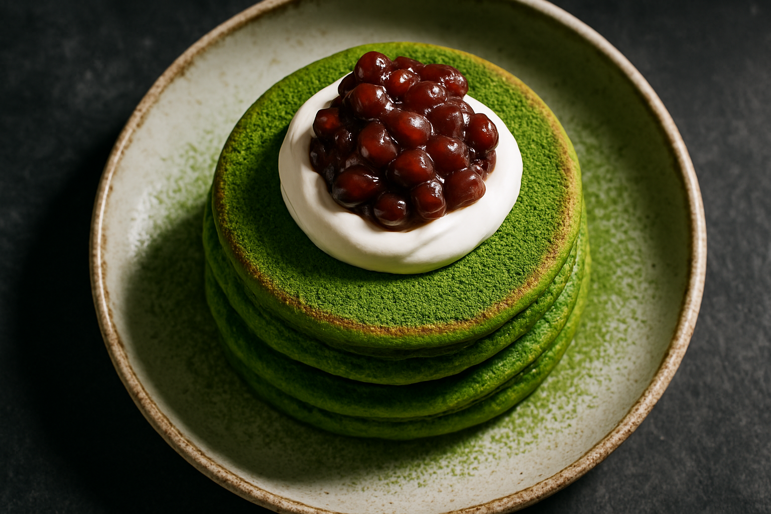 Uji Matcha and Red Bean mochi pancake stack with matcha powder and red bean topping
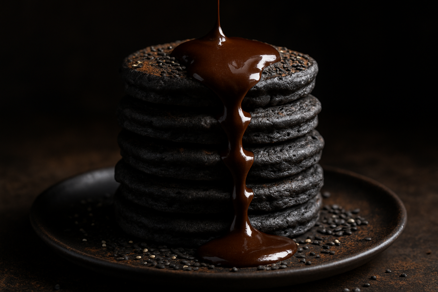 Black Sesame Lava mochi pancake stack with molten center flowing over the tiers